The client already has a logo and is looking to give it a modern look. The Company is SOCO Marketing, based in Colorado. The client's description is below:
"Already have the logo, would like it redone in a cleaner fashion. Business name is SOCO Marketing, which stands for Southern Colorado, and I would like the C to appear similar to the "C" in the colorado flag (reference image attached).
I'm also open to making it better if you are creative enough to design something different and eye-catching."

Original logo
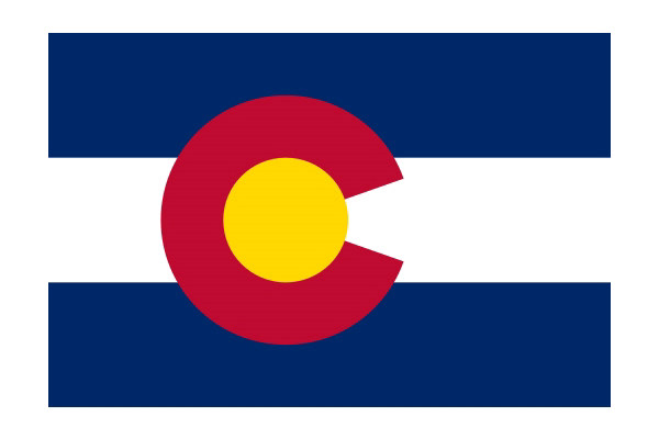
Colorado flag


Changes to the logo revolve around the typeface. The typeface is the same as the Colorado flag: Gothic. Additionally, I used Century Gothic for the sub-text. Further, the client wanted the "C" in "SOCO" to be like the the "C" on the Colorado flag. Hence, I made slight changes to the outline of the letter.
I kept the colors and design the same, but the change in typeface adds the modern look the client is after. I also added black to the logo and used the original colors sparingly throughout the logo. The "C" is the only fully colored letter, putting emphasis on that letter, as it resembles the "C" on the Colorado flag.