The Summer Bible Camp is a Christian-based camp hosted by the Church in Irvine for children in K-6th grades. The logo was designed to reflect the focus of SBC as well as match the Church in Irvine brand identity.
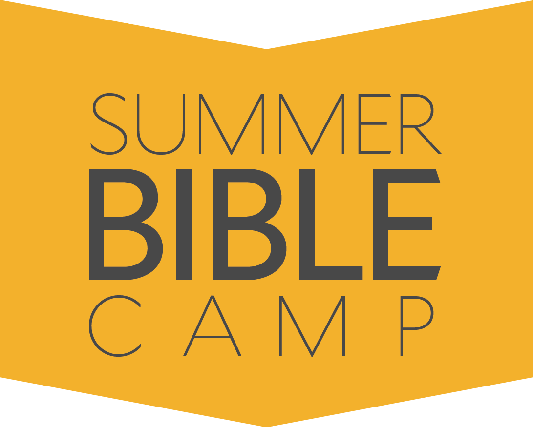
Primary Logo
Secondary Logo
SBC is centered on educating children regarding the bible. Hence, the icon of the logo is in the shape of a bible. The bible icon also reflects the pattern found in the Church in Irvine style guide, shapes which represent the community of Irvine and the perspective of believers meeting from house to house.
The yellow is a secondary color in the Church in Irvine brand identity. However, this is the primary color for the SBC logo to showcase the time of summer, a time full of sunshine and that conveys a feeling of happiness.
The logo was designed in collaboration with other designers and coordinators of SBC.